
"Nothings stopping you now.."
In my role as a Thinkful student, I had the challenge to communicate bus arrival times to bus riders from transit officials. This case study allowed me to empathize with everyday bus riders who rely on buses as their main form of transportation. Based on User Interviews & Surveys, I identified pain points and created a solution called "Stopify" - an app that offers real-time updates to give bus riders predictability in an unpredictable world.
PROCESS

-
Field Research
-
Competitive Analysis
-
User Interviews
-
Personas
-
Storyboarding
-
User Flow
-
Site Map
-
Solution Sketches
-
Paper Prototype
-
Usability Testing
-
Iterations
-
Prototype
-
Test & Continue
PROBLEM
Whats the Problem?
-
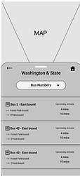
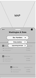
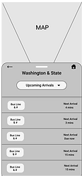
7 new bus lines were added to the Washington & State bus stop. Transit Officials needed a way to communicate schedule information to bus riders.
-
Riders need to know:
-
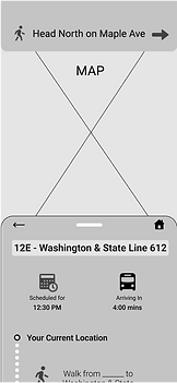
Which bus is arriving at the station?
-
How long do they have to get to the bus stop?
-
What are the future arrival times for all 7 bus lines?
-
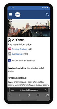
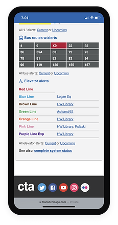
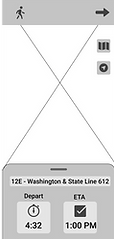
THE OLD UI
AUDIENCE & CONSTRAINTS
Everybody deals with constraints...
I knew my audience would be bus riders in metropolitan areas. The question was, how do I reach out?
Working remotely I was 1+ from any bus that wasn't for primary school. I had to utilize my east coast contacts & Reddit respondents in order to avoid diluting my data.
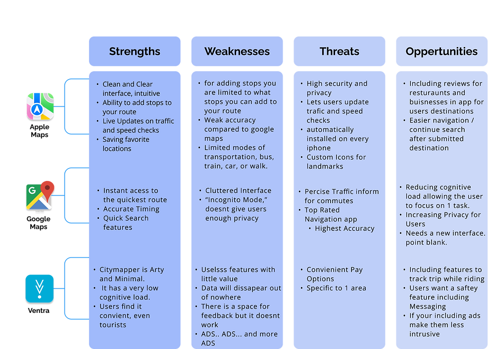
COMPETITIVE ANALYSIS
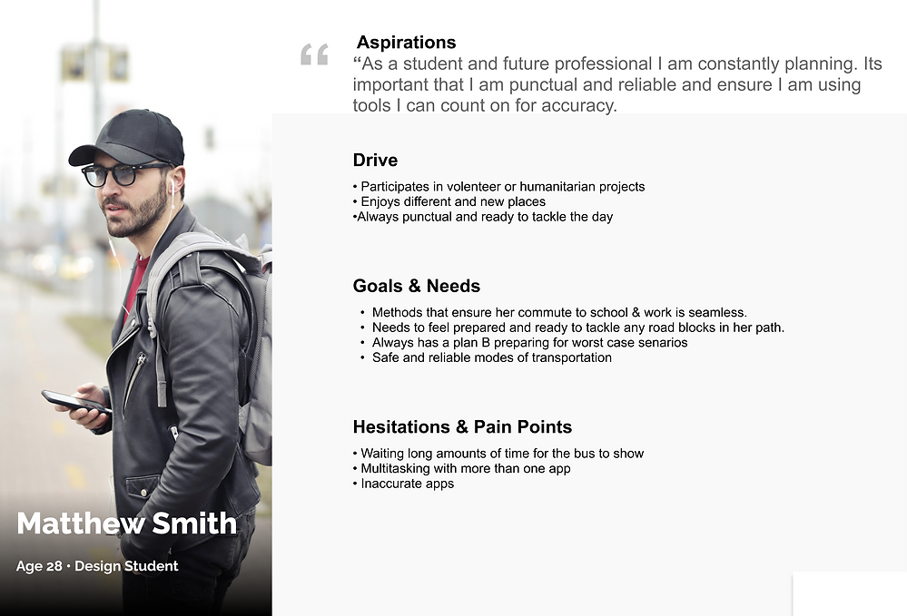
PERSONA
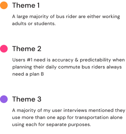
USER SURVEYS & INTERVIEWS

USER STORIES
First, we need to narrow the scope. It is essential to define our User Stories and organize them by the upmost importance. This gives us a great foundation to work to avoid veering off track.
-
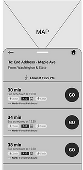
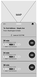
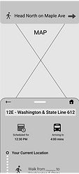
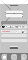
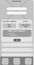
As a bus rider, I want to check on the status of my bus, so I can know the exact time it will arrive at the Washington & State bus stop.
-
As a bus rider, I want to know when my bus arrives at the station so I can board the correct bus.
-
As a bus rider, I want to see where the bus is in route so I can calculate how much time I have to get to the bus stop.
GOAL
UX inspired by Google UI inspired by Apple
Include:
-
Clean Interface that brings a sense of ease to users
-
Intuitive and in line with transit apps
-
High Accuracy
Avoid:
-
Too many additional features
-
Cognitive Overload
-
An interface with too many colors


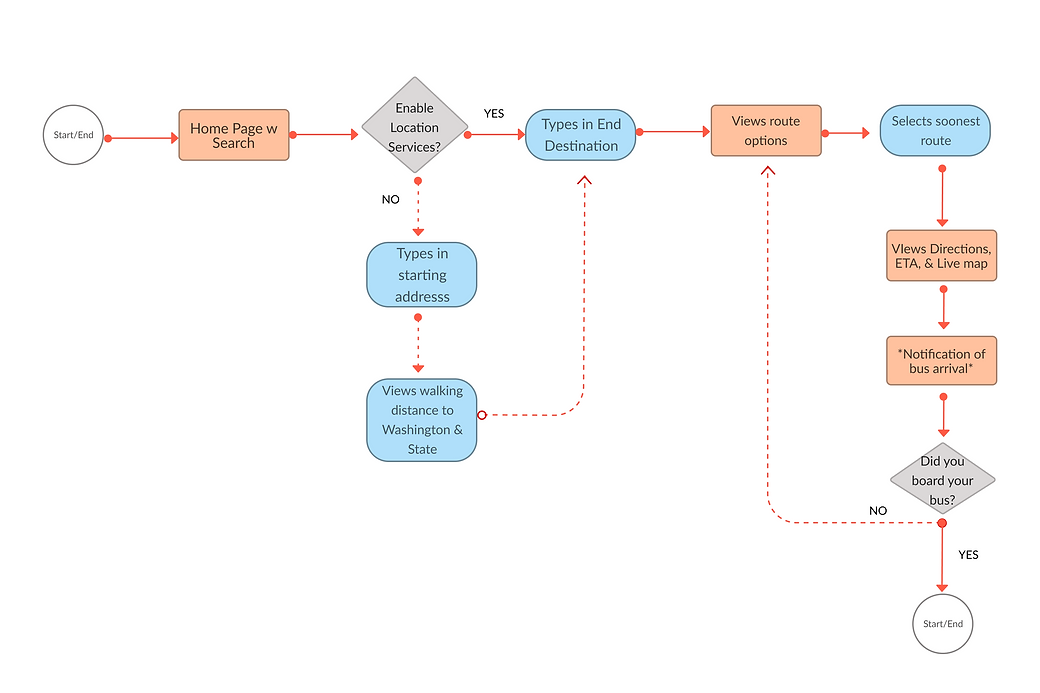
FLOW CHART
Whats the flow?
IDEATION
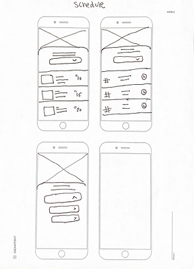

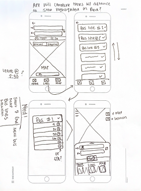
LO-FI PROTOTYPE
The Prototype
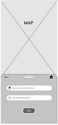
In the beginning, I thought I would have this down pat. I planned on creating an app with a start-to-end search. To reduce any cognitive load, I intended to have the user search for their destination and then view possible routes, much like Apple Maps. My idea felt great! only there was one thing missing.... the user!
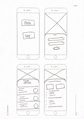
WIREFRAMES
The Beauty of User Testing...
ITERATION 1
A pivot was necessary, my app was split into two flows. Users can still retrieve directions from start to finish with the first flow. In the Scheduling area, users can view upcoming schedules and stop information as well as view bus lines and schedules on the flow. During my competitive analysis, I came up with the reasoning for two separate flows. It's when you combine all of that information on one page that the user gets overwhelmed by choice overload. Transit apps come with a lot of options and additional information. Users almost always have a deadline when we use a navigation app, whether it's for a job or an appointment. As a result of user testing, I learned that plan B needed to be within reach, returning to the landing page to reach an additional feature wasn't the best option.
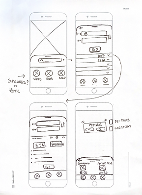
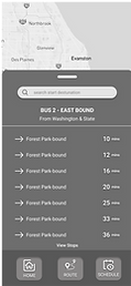
ITERATION 2
In my second Iteration, the drop-down menu became confusing. When you have to explain your design you know it’s time to get back to the drawing board. There were twice as many taps with multiple drop-down menus so I took them out and settled with a simple navigation bar. Originally I wanted the app to have a "countdown" feature for their bus's arrival time. Through more user testing I learned this brought anxiety and/or irritation to the user whether their bus was arriving late or early.
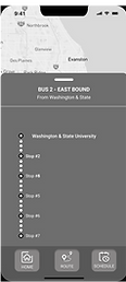
ITERATION 3
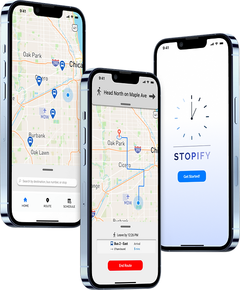
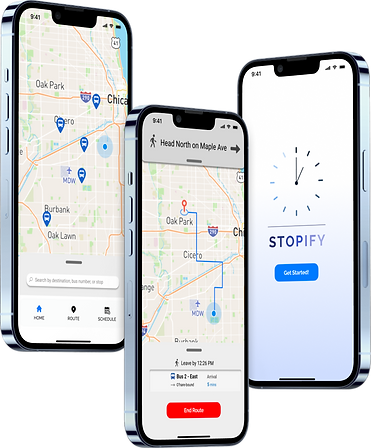
The final product! Finally, my users were navigating with ease, my last test was on my 15-year-old sister. She like me is unfamiliar with public transportation. Without a license or previous use of GPS she did it, no questions asked, I knew I was on to something.

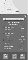
SOLUTION
Here's what actually happened...
My experience with user testing taught me humility in design. As I learned, allowing my users to access features and keep them within reach would require more than I anticipated. I also had to lay a couple of pages to rest to accomplish this…*moment of silence for the fallen*. To stay on track, I had to revisit the scope and remind myself whom I am designing for throughout my process. Every day, our lives are made easier, faster, and more intuitive by the online experience. It is key to spend less time on information that isn't relevant to our task. Overall I learned no matter what, no matter the intention, it can mean nothing if it isn't for the user!