
“A personal meditation guide, right in your pocket”
For my capstone project, I had the opportunity to select a passion project. I went down multiple avenues hunting for what felt like the right fit. This project started as a redesign for a podcast, morphed into a case study on the perception of meditation, and resulted in a headspace redesign. During this case study, I dove into WHY people feel hesitant to meditate, I wanted to know a general perception of meditation and why humans take an hour a day for their body... but not their brain. The solution boils down to something simple. There is 1 app on the market hitting 80% of my user's needs, that app is Headspace.
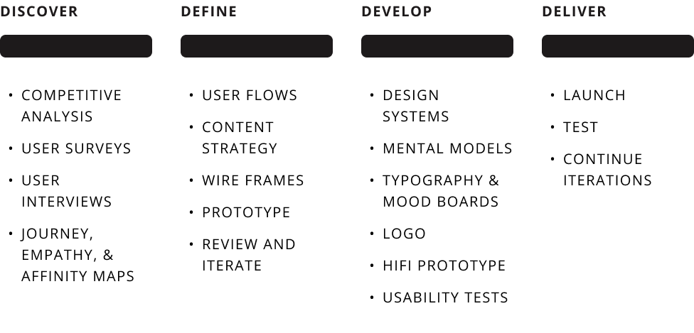
PROCESS
PROBLEM
What's the Problem?
-
Meditation should be a carefree exercise, accessible to anyone, anywhere, anytime. Unfortunately, that's not the case for a lot of users.
-
How Might We...
-
Help users understand the concept of meditation
-
Understand why people value meditation but don’t prioritize it
-
Engage users in a long-lasting relationship with meditation
-

AUDIENCE & CONSTRAINTS

Everybody deals with constraints...
During this project, I learned meditation can be a sensitive and intimate topic. For some, it can feel like a personal journey like writing in your diary.
On the other hand, we can all admit at times it's hard to communicate our thoughts and emotions. Through my research, I was faced with many users who know they have a problem but they don't know how to express what that problem is.
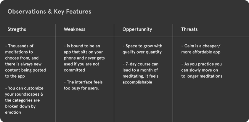
COMPETITIVE ANALYSIS


USER SURVEYS & INTERVIEWS
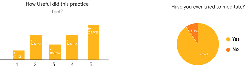
A majority of my users had tried meditation before but it didn't stick for all of them and 32% of users 'Rarely' meditate. So I dove deeper into the data to identify some key patterns amongst those who do and do not participate and pulled out 3 key insights.
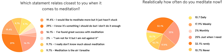
KEY INSIGHTS

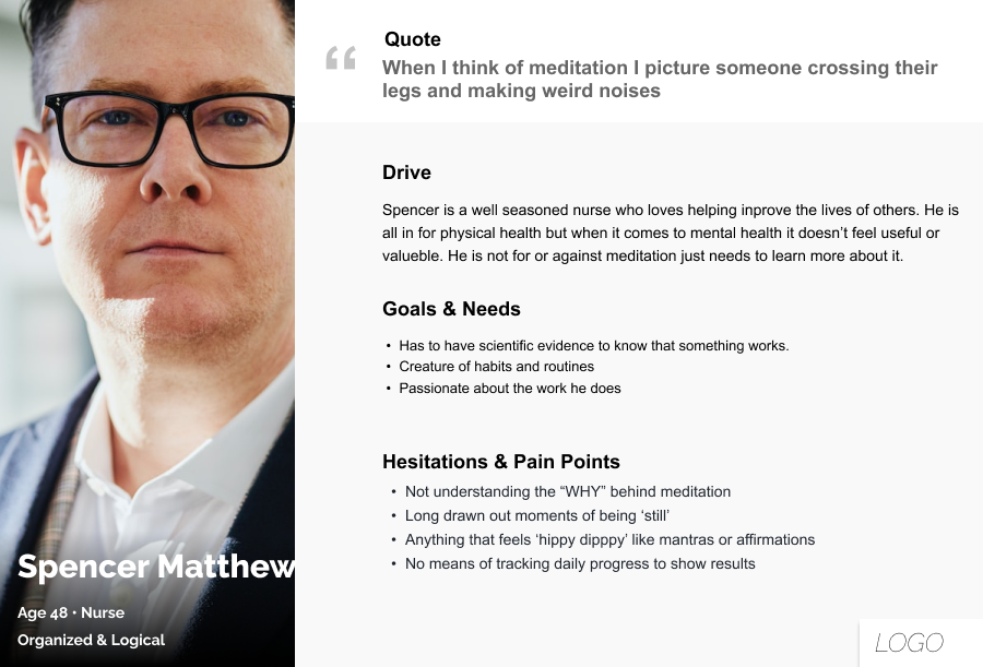
PERSONA
JOURNEY MAP
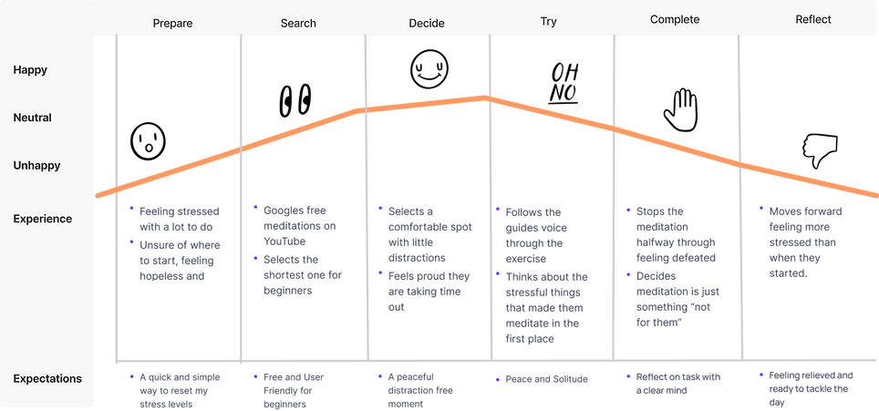
GOAL
UX inspired by Google UI inspired by Apple


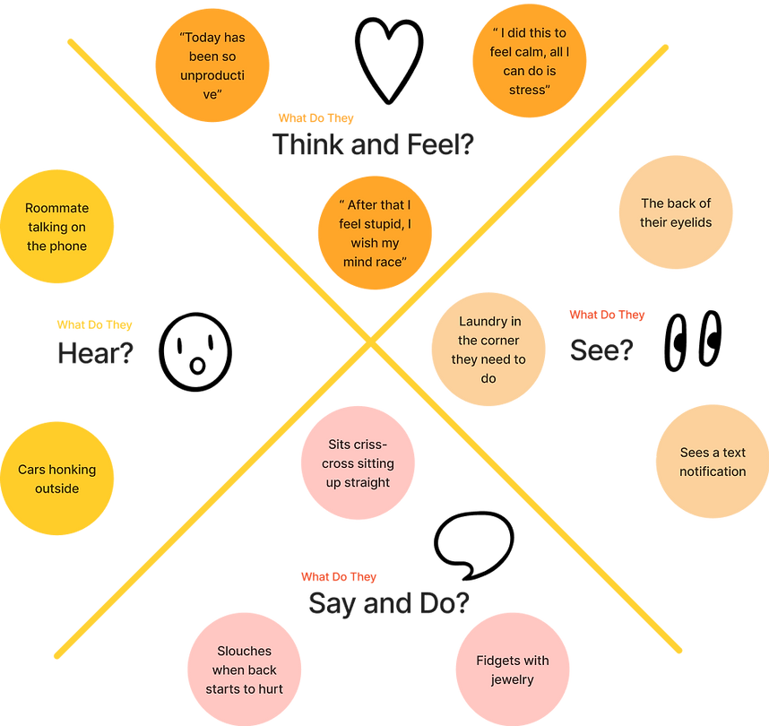
EMPATHY MAP
USER STORIES

-
As a new user, I want to understand 'How' to meditate so that I can feel productive and encouraged when I try.
-
As a new user, I was to have visual aids or videos so I can learn and understand the concept of meditation
-
As a new user, I want to be led through a beginner course so that I use my time wisely.
FLOW CHART
IDEATION
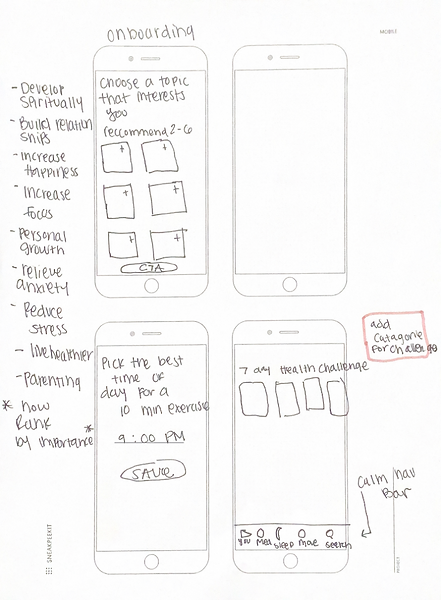

LO-FI PROTOTYPE
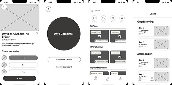
The Prototype
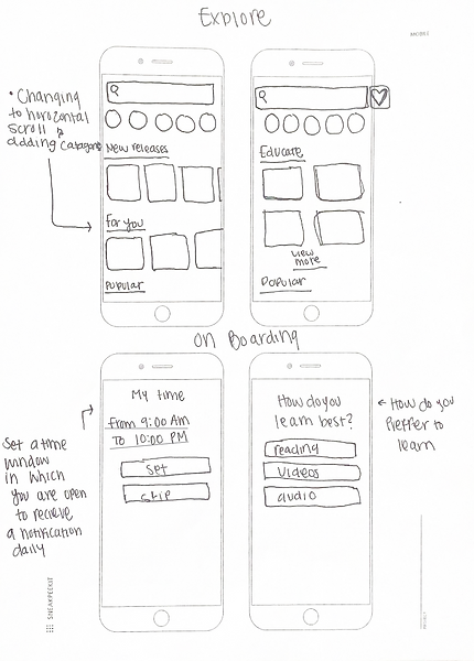
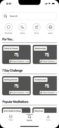
Starting off I had a couple of ideas in mind. I knew going into this I would need to focus on the onboarding process. In addition, I wanted to change the explore page to a list of horizontal scrolls. As a new user when you enter the headspace app you are faced with an overwhelming amount of meditations with not much reason or order. If a user has a popular page or section designed specifically for them they are more likely to get started right away on their journey to mindful meditation.
WIREFRAMES
The Beauty of User Testing...
ITERATION 1
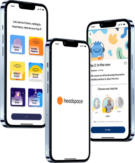
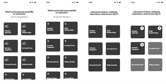
In the first iteration of the initial design, it was necessary to change the onboarding questions. Imagery can be essential in surveys to evoke emotions necessary to the question at hand. The typical onboarding questions in headspace lack color and can be hard to follow for users. Through usability testing I needed to get rid of most of the frames, removing the first 3 I decided on having the user rank their priorities by their top 3 concerns.
ITERATION 2
After fine-tuning the onboarding questions I moved on to the explore page. When a user is new to the headspace app the explore page is filled with an endless vertical scroll that lacks hierarchy. Keeping beginner users in mind its essential to keep education at the forefront, after all meditation is an ever growing practice and changing your perspective is all about learning.
ITERATION 3
In my competitive analysis, it was clear that users appreciated personally designed courses for beginners or someone who knows what they are doing. I decided to do both, upon onboarding the user selects their top 3 priorities which translate to their "Modalities of Meditation". In usability tests, users disliked when competition or challenges was brought into the picture. By naming the course Modalities of Meditation it gave users ease and took away any shameful thoughts of missing a lesson or day of meditation. Lastly, in my user testing there was confusion between the play button and button to select your instructor, the solution to this was turning the buttons into a sliding carousel to define the roles of each feature.

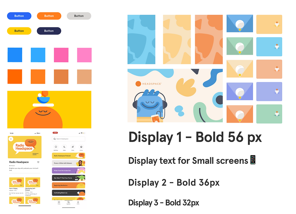
BRANDING
Before
After
SOLUTION
Here's what actually happened...
I realized the reality was I was going to need to make the onboarding process short and sweet with the goal of engaging the user to make the process light and fun. I added a section for the "Modalities of Meditation" which serves as a guide for beginner users while taking away pressure during the progress. The explore page was well loved by users as it was easier to follow and explore. The horizontal scrolls allowed users to get a sneak peek into what lies within the categories. I learned when we educate users it gives them an opportunity to make commitments that will last longer because the user understands the WHY.